Monday 14 February 2011

I also went out to a news agent and took a look at some other R&B magazines; I noticed that they had similar codes and conventions. For example, on all of the magazines I found excluding 'Echoes' and 'Pride' magazine, the person(s) on the cover shot's head was in front of the title; I think that this is done to show that the magazine is well known and distinct meaning that just by seeing the first few letters of the title, you already know the rest even if the model's head is covering most of the rest. Another reason could be to create depth and give the magazine a 3D layering effect.


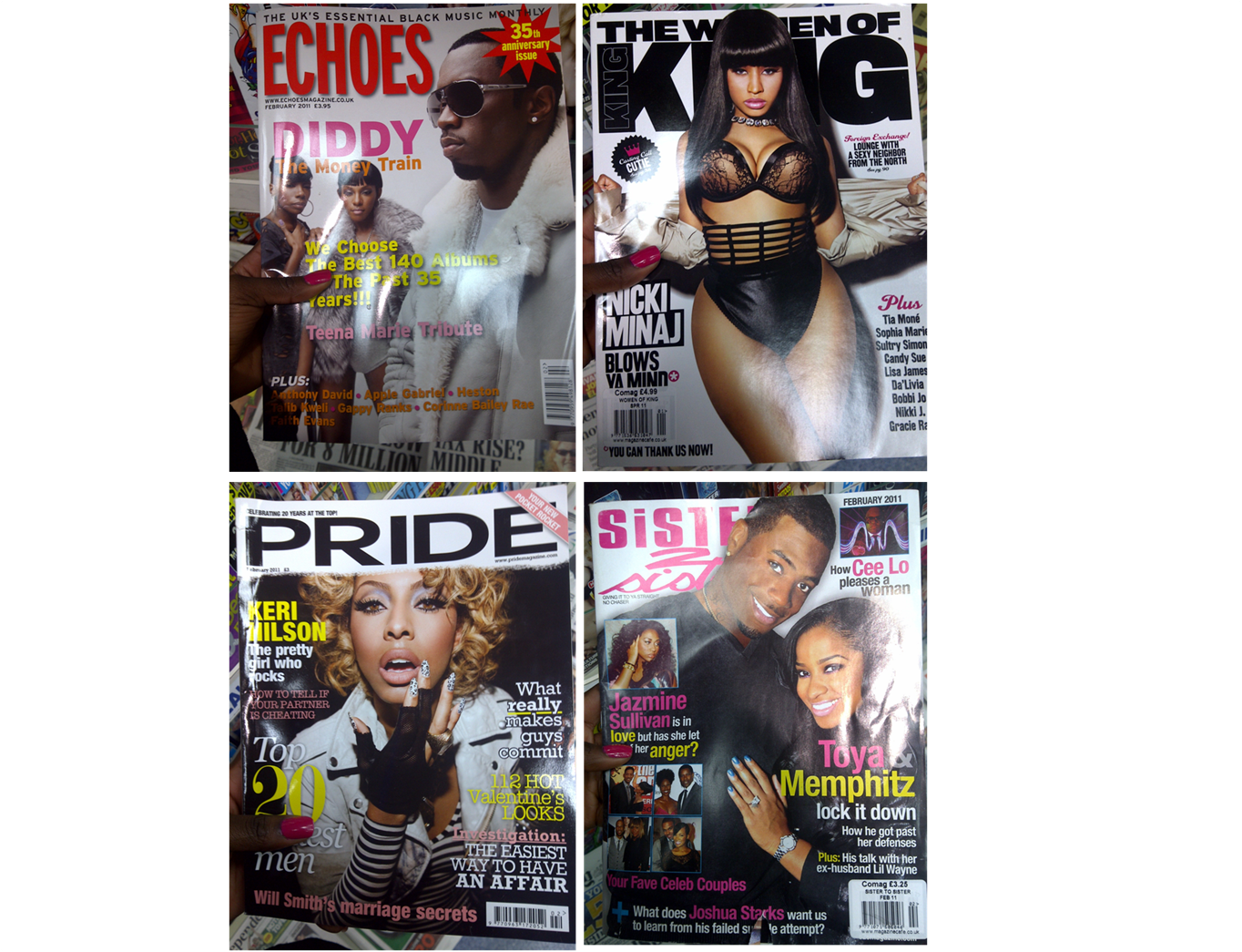
The convention I found with the magazines is that they had a set colour scheme of about 3-4 colours. For example with the pride magazine we can see that the set colour scheme is white, black, yellow and a bit of pink; from this we can see that magazine may not be entirely feminine although the cover shot is a female, I say this because they have avoided using strong feminine colours such as pink and purple; the yellow gives a summer feel and the black and white is very neutral giving the magazine a clean look. In the same way the 'King' magazine has also used the white and black for the same rich clean and pure effect finish (The colour white can also represent extremely white sneakers and clothes worn by many R&B stars.

After looking at the magazine covers I decided that I should defiantly use either black or white (or both) as they are colours which are used in most R&B magazines, they also help to make the busy magazine look a bit more spacious. I have chosen to have a colour scheme of 4 colours maximum to avoid having an unsuccessful colour crash which may cause my magazine to look crowded and childish with all the unnecessary colouring. I will also be having the models head in front of the title so that it looks like the picture is coming out of the magazine rather than it looking like a flat image, however I do like the way 'Pride' magazine has broken the convention. Having the models head in front of the title will also allow the reader to see their face properly, this will be important especially if my front cover model is a new artist.
After creating my mood board and discovering that my magazine needs to be quite 'sexy; and 'slick' I took to the Internet to find some example R&B type magazines to give me an idea of the codes of convention that I need to be aware of in the production of my magazine.
With my findings I created this collage:


A code I noticed on the R&B magazine front covers I they are using the gaze theory as they have a direct mode of address (excluding the 'Vibe magazine' with Keisha Cole on the front) as the artists on the front cover are looking directly into the reader's eyes/camera lens; this is done to stimulate interaction between the reader and the magazine. I think that the reason why Keisha Cole is looking away on the cover of 'Vibe Magazine' is because it gives her some control and makes her look like she is thinking or looking at something, this may make the readers want to know what she is looking at. The problem with using indirect mode of address such as the one used on the Vibe Magazine with Cole is that it can create a sense of absence between the model and the reader. I also noticed that the camera tends to be looking up at the artists, I believe this is to once again make them look powerful and make the reader look up to them either as their idol or just because there is a lot of dominance when it comes to R&B.

Monday 7 February 2011

Looking at my mood board I realised that there were some things that did not really fit in such as the cartoon of the cartoon representing the female rap artist Cher Lloyd; although it did fit in with my target audience.  Instead it looked like a picture that would be found in a kids music magazine (especially as the cartoon is very animated- e.g. extra large head and funny face expression). My target audience are males and females from the age of 16 to 25 who love R&B and Hip Hop music. The main audience of this genre of music  was traditionally  black  people however there has always been a white following of hip hop and R&B but it was always predominantly black. It was not until the late 90s that there began a large white following due to the rise of white hip hop and R&B  artists such as Eminem , Vanilla Ice and MC Hammer.
I believe that my target audience will be attracted  to my magazine because it will give them all the latest information and gossip on their favourite Hip hop and R&B artists. My magazine also specifies on a specific genre meaning that my readers can get exactly what they want.

I also thought that it would be best to take out the photo of rapper 'Rick Ross' holding a huge chain and also the photo of rapper 'Fabulous' holding his big chain (the two artistes in black tops holding large chains). I took them out because I believe that they looked too Hip Hop due to the sunglasses and extremely large chain, they did not really show the ‘
soulfulness’ of R&B. I also thought that the 'I love R&B' hat was definitely out of place and also looked quite childish, furthermore I doubt any rap artist would wear it as it looks a bit cheap and underrated. Another thing that I do not think matched my genre was the club scene, I think that it looked like it belonged in the house/indie style genre.
After examining my mood board I edited it creating one that represents the R&B genre as it is


Although I used many of the old pictures but I also replaced and added some new ones. For example I added another R&B cover with a half naked man and woman to emphasise how sexualised females are supposed to be and how men's bodies should be able to look good topless; just like the other album cover (Sexy R&B) it also emphasises sex being a main part of the style. I added an artist with his car as we all know they love to show off to prove their wealth. The picture of Will I am (man wearing some white Doctor Dre Beats headphones) is to show that DR Dre's headphones are a big part in R&B as many rappers and singers in the genre such as Will I am and Soulja Boy wear them. 

Overall I am much happier with my new mood board as it fully represents a lot of mail parts of R&B which I discussed n my operationalization.

My first thoughts

The first thing I had think about before making my music magazine was what genre my magazine should be. I thought it would be a good idea to chose to do a genre which I am familiar with, as a result I chose to create an R&B magazine. I realised that some images and fonts I may use may overlap with other genres such as pop and hip hop because R&B is a very broad genre. To make sure I get a clear idea of the genre I began by operationalzing my chosen genre by asking questions such as 'what is R&B?' And 'what does it involve'

R&B is the an abbreviation which stands for Rhythm and blues, it is a popular African American music that originated in the 1940s. Contemporary R&B  is a music genre that combines elements of both hip hop and R&B.

I looked at magazines such as Vibe magazine and King magazine as well as videos on MTV base (an R&B) music TV station. I also looked at some pictures of R&B artists.
I learned that R&B has become very sexualised over the years but has also brought out a lot of Strong, confident female rappers and singers who seem to be in control of their lives. However a lot of the females have to sexualise themselves in order to sell and fit in properly with the genre which may not mean that they are in full control of their image. Males on the other hand tend to wear a lot of bling and dress come out topless and have a fit build, I believe this is to attract females and show other men that 'toned is sexy and it is what females want'.
Some other stuff I found that related to R&B included:
-Low cut tops for females
-Big bust for females
-Toned men
-Sex being glamorised
-Men being surrounded by many girls
-Clubbing/partying
-Rap
-Showing as much skin as possible
-whining/grinding as a dominant dance move as well as ' the jerk' dance move

With the knowledge gained  from my
operationalization I made a mood board showing things that represent the R&B: